 Weren’t we just mad about Marsala? Release that. Pantone announced the 2016 Color(s) of The Year: Serenity and Rose Quartz.
By Maureen Mancini Amaturo
 Weren’t we just mad about Marsala? Release that. Pantone announced the 2016 Color(s) of The Year: Serenity and Rose Quartz. Yes, TWO colors. This is a first-ever. Since the Color Of The Year Program began in 2000, there has always been one shade on stage. While it’s surprising to have two colors share the title, it’s not surprising that the sentiment of the trends is reflecting the desire for a rosy outlook and tranquility.
Softer, kinder, these colors are a total turnabout from the bolder, stronger shades that have worn the crown for the past five years. “Rose Quartz is a persuasive yet gentle tone that conveys compassion and a sense of composure,” Pantone says on its website. “Serenity is weightless and airy, like the expanse of the blue sky above us, bringing feelings of respite and relaxation even in turbulent times.” On Pantone.com, Leatrice Eiseman, Executive Director, Pantone Color Institute, writes, “Colors this season transport us to a happier, sunnier place…” So that explains it. If it’s peace and happiness you want, at least you’ll find it in the colors this year.
Color trends, like all fashion, reflect cultural moods, society/ historic happenings, and even politics. A big part of Pantone’s decision on this twosome is to reflect a general trend toward gender equality and gender blur in fashion along with a growing comfort level to use color as a form of self-expression. (The 2016 colors are very close to the Transgender Pride Flag colors.) This duo reflects the designs rising to the top in fashion and interior décor, but you’ll see them pop up in advertising, book and album covers, packaging, etc. Even a photo editing app, Aviary, is offering selfie tint filters in these shades. Will you be picking up a Rose Quartz Keurig for your kitchen? A Serenity couch? How will you be welcoming the 2016 colors into your new year? Start with your closet.
{gallery}fashion1.22.16{/gallery}
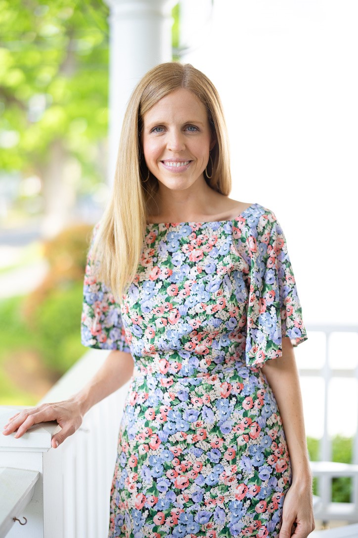
Already seen in the Prada, Chanel, Valentino, and Carolina Herrera Spring 2016 runway shows, watch for them to appear in plaids and paisleys. Take their babyish first impression to sophisticated by choosing tailored silhouettes and textured fabrics. Silk in either color will look elegant. Not that you have to wear these shades together, but they can make an enchanting outfit, i.e., Rose Quartz pants with a Serenity button-down blouse. Both shades work well in any finish: matte, metallic, glossy, faux leather, and sheer fabrics. Both get along well with mid-tone colors like greens, purples, browns, and yellows.
Makeup and hair offerings in these shades are très varié. Pink hair tints have been a favorite for a long time. With Rose Quartz in the driver’s seat, it’s bound to be even more popular.
About Rose Quartz: It’s a romantic color, which hasn’t gone unnoticed by the bridal industry. There’s a rush of rose and blush dresses and wedding themes. Pair this rose with gray, any shade of gray. It’s a neutral effect with interest. Try it with a subdued plum, too. Beautiful with navy and dark jeans. Of course, it’s stunning with black. The best metal pairing: gold.
About Serenity: Gorgeous with dark denim or navy. For a neutral look, try an almond or camel shade or grey. Don’t ditch the Marsala items you bought last year. Serenity and Marsala are a surprisingly great combo. Try it with olive green, too. The best metal pairing: silver.
Well, black-clad, pastel-phobic New Yorkers, there’s always next year.


